GetPower® is a brand of aftermarket mobile accessories specifically designed for impulse placement. The brand is known for their brightly colored packaging and products, and their competitive price points. With this in mind, I was tasked with redesigning the brand to something clean and modern, without losing the colors or changing the packaging style.
I started by re-working the colors. Since GetPower sells a wide variety of products, I decided to give each category a color:
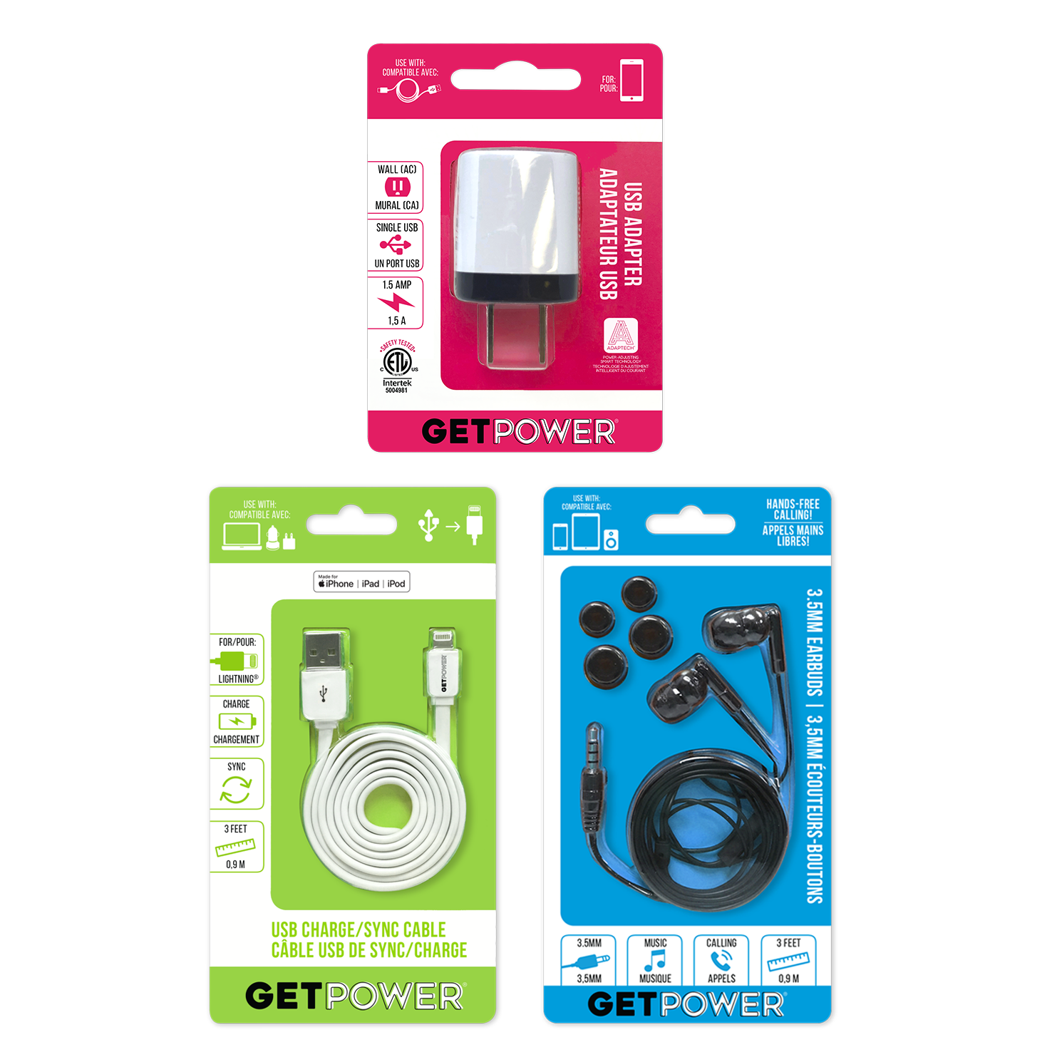
Pink = adapters, green = cables, blue = audio, purple = other.
Then, I moved on to making the packaging easier to read and understand. Icons would play a big part to cut down on verbiage, the grunge fonts would definitely go, and the color would be limited to that of its category.
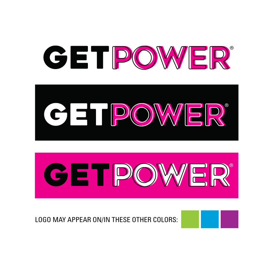
My final step was a simple logo design. Since the company wanted to keep the logo as a word mark, I used bold, simple fonts in a style that was versatile, easy to read, and didn't take away from the clean design.
To see more, visit ariesmfg.com.
A retail-packaged piece from the 3 main categories of the line.
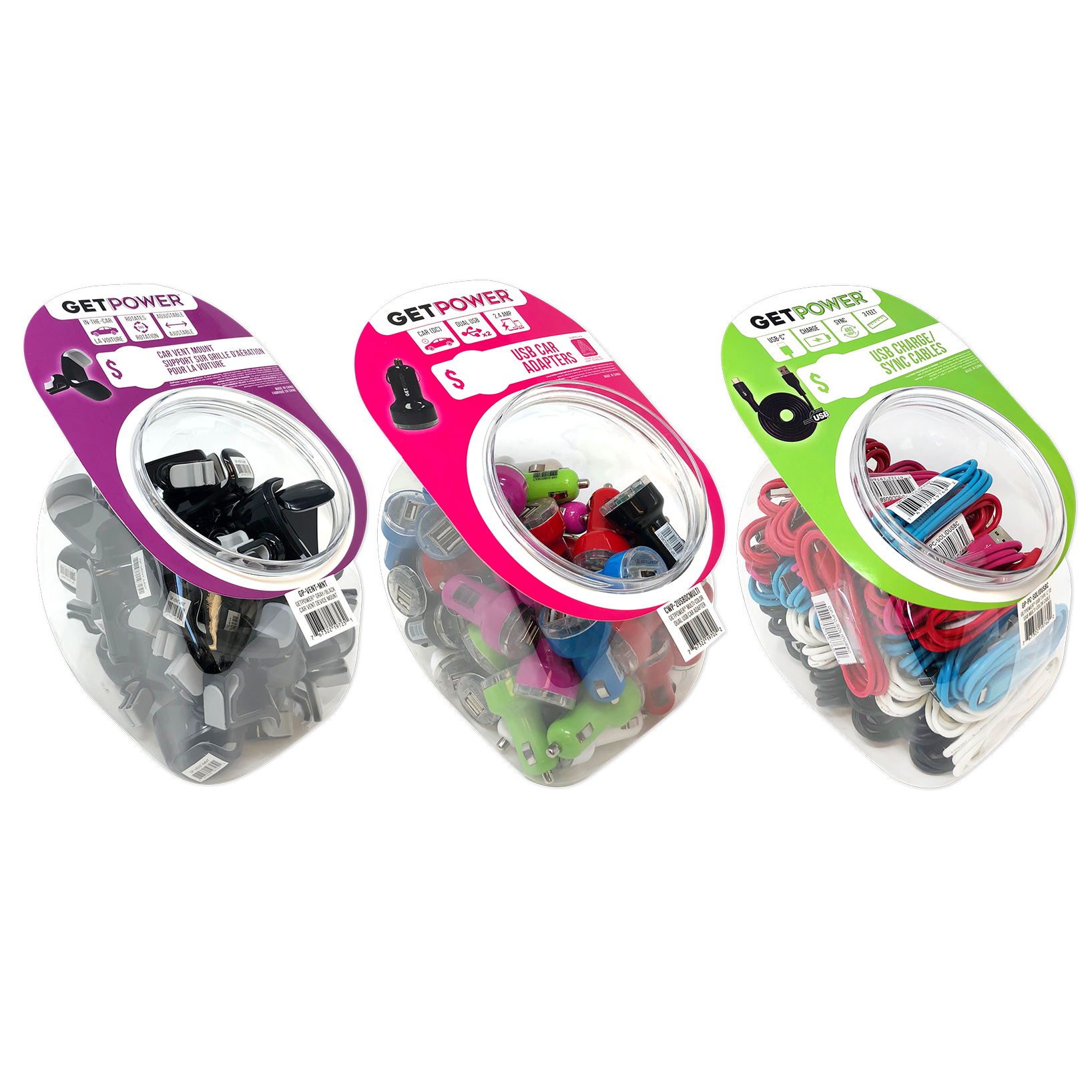
Impulse bowls in 3 categories.
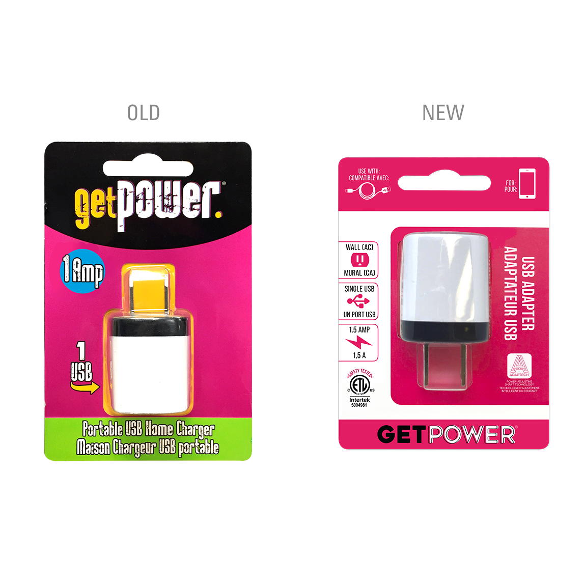
Old and new packaging for the 1 USB AC adapter.
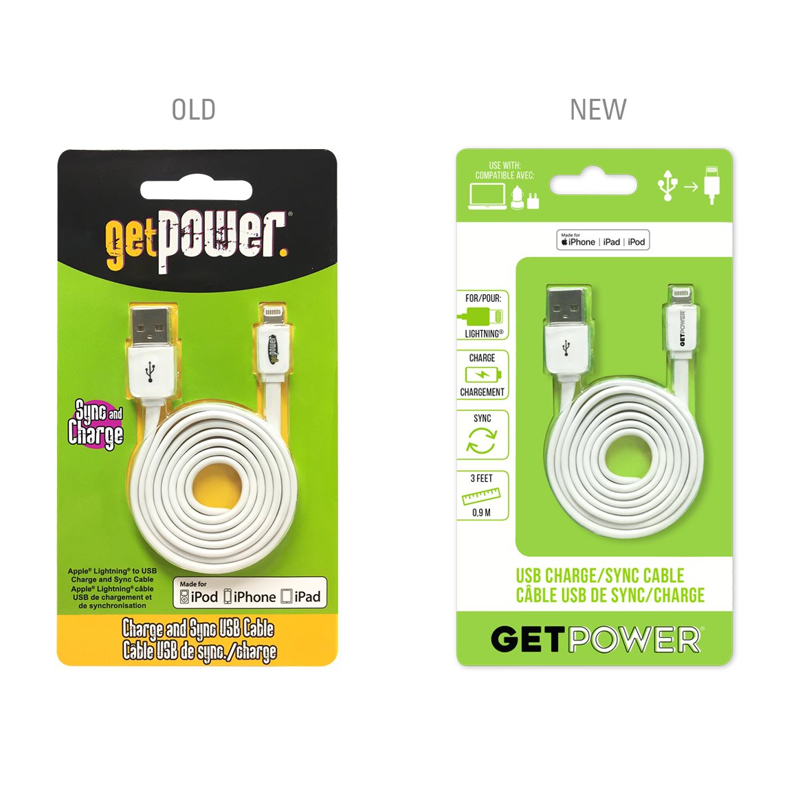
Old & new packaging for a charge/sync cable.
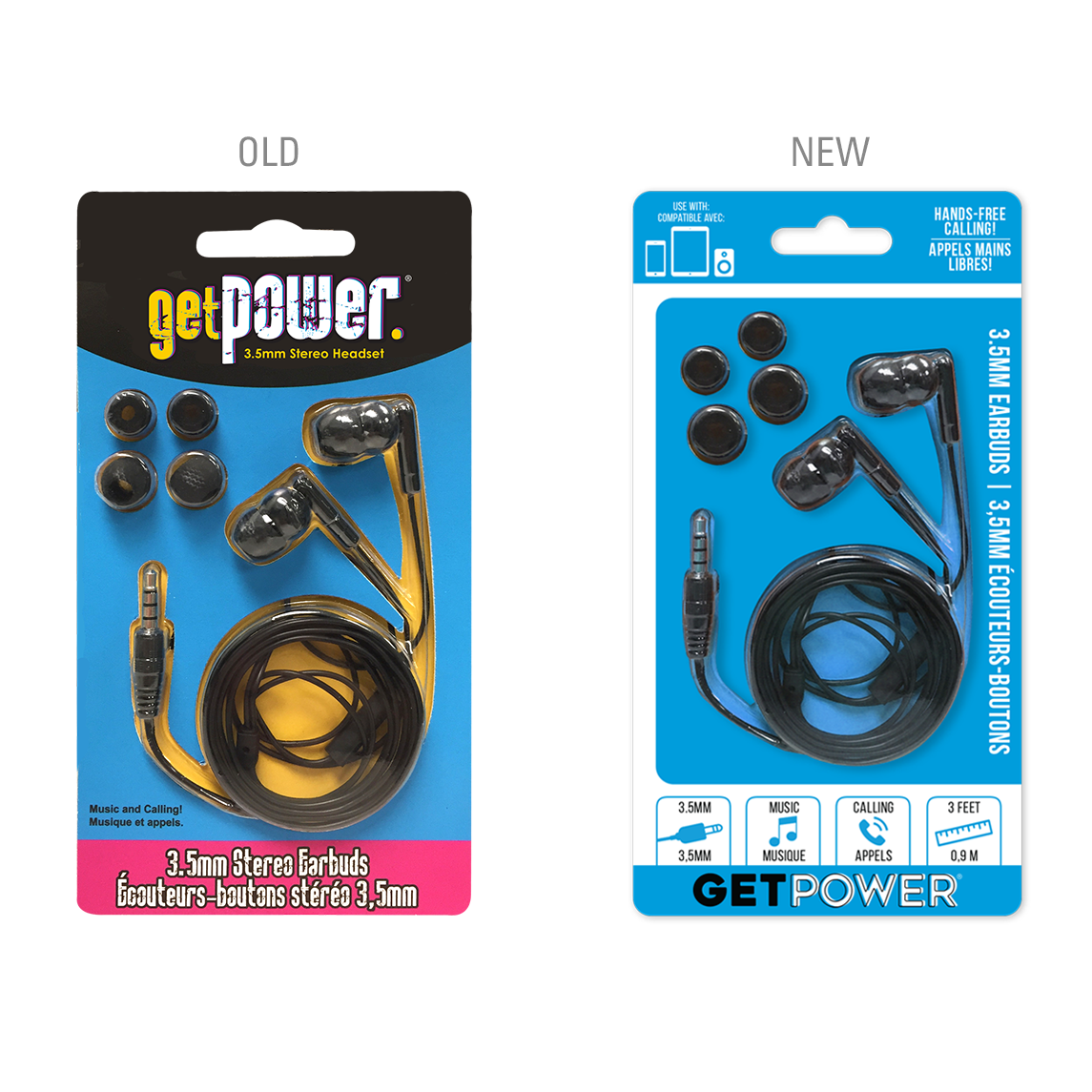
Old & new packaging for a set of earbuds.